So, you want to create an aesthetic Instagram theme? It starts with defining a consistent color palette that fits your brand or personal style. From there, you shoot and edit all your pictures with the same visual approach—using presets or manual tweaks for a unified look. Finally, you plan your grid layout with an app to make sure everything flows together. Simple as that.
We’ve all been there. You post high-quality photos, write witty captions, and use all the right hashtags, but your profile still feels… random. One post is bright and vibrant, the next is dark and moody. This kind of visual whiplash can confuse potential followers and make your brand seem less polished. A cohesive theme, however, transforms your grid from a random collection of images into a compelling visual story that grabs and holds your ideal audience’s attention.
What Is an Instagram Aesthetic?
Ever landed on an Instagram profile and instantly gotten a vibe? That’s an aesthetic. It’s the curated, consistent visual identity of your account—the overall look and feel a visitor gets at first glance. This theme is built from several key elements working in harmony: a defined color palette, a uniform photo editing style, specific content types, and a planned grid layout. Think of it as your brand’s digital storefront; it should be inviting and clearly show people who you are.
But a strong visual identity does more than just look pretty. It builds brand recognition, making your content instantly identifiable as users scroll through their feeds. Plus, it helps attract your target audience, because people who resonate with your style are more likely to follow and engage. A well-executed theme signals professionalism and care, which builds trust with your community.
How to Choose Your Core Color Palette
Your color palette is the foundation of your entire Instagram vibe. These core colors will guide your photo shoots, editing choices, and even the graphics you share. Honestly, the most efficient way to start is by looking at what you already have or what you’re naturally drawn to.
For Existing Brands and Businesses
If you have an established business, this part is easy. Just look at your existing brand identity. Your logo, website, and marketing materials already have a color scheme, so pull two or three primary colors and one or two accent colors from that palette. For instance, if your brand uses navy blue, white, and a touch of gold, those should be the main colors you feature in your feed. This ensures your Instagram profile feels like a natural extension of your brand.
When Starting From Scratch
If you don’t have a pre-existing brand, it’s time to find some inspiration. Pinterest is my go-to for this. Create a new, private board and start pinning images that catch your eye—anything from fashion and interiors to travel shots and art. After you’ve pinned 30–50 images, take a step back and look at your board. You’ll quickly see patterns emerge. Maybe you have a thing for earthy tones, bright pastels, or a minimalist black-and-white look. From those patterns, select three to five complementary colors for your palette. Just remember to use this for inspiration, not imitation; the goal is to develop your own unique style.

Maintaining Consistency in Shooting and Editing
A consistent aesthetic is built long before you even think about applying a filter. The raw images you capture must align with your desired look from the get-go, since no amount of editing can fix a photo that fundamentally clashes with your theme. Consistency in both shooting and editing is non-negotiable.
When you’re shooting, think about your color palette. If your theme is warm and earthy, seek out locations with natural wood, brick, and cozy lighting, while making sure your outfits and props also feature your brand colors. A light and airy theme, on the other hand, demands bright, open spaces with lots of white and soft, natural light. Planning these details beforehand makes editing so much simpler.
Once you have your photos, the editing stage is where you lock in that cohesive feel. Using the same preset or a consistent set of manual adjustments across all photos is key. Apps like Adobe Lightroom Mobile are perfect for this. You can buy presets from creators you admire or create your own to apply your signature style—like boosted warmth, muted shadows, or increased saturation—with a single tap. This step ensures every picture fits perfectly into your grid, regardless of its original setting. For those just starting, exploring the best photo editing software for beginners can give you the tools to develop that unique style.
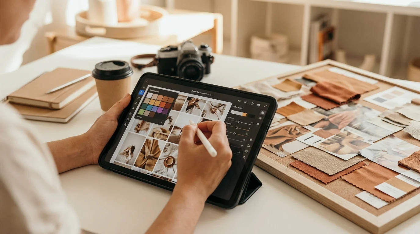
Using Tools to Plan Your Feed
Planning your grid layout in advance is the secret to a polished and balanced feed. It lets you see how your photos will look next to each other before you post them, which helps prevent awkward color clashes or repetitive content. Using a dedicated planning app takes the guesswork out of it and helps you curate your feed with intention.
Tools like Later, Planoly, and Preview offer a drag-and-drop interface where you can upload your edited visuals and arrange them to create the perfect flow. When arranging your grid, look for balance. Here are a few layout strategies I’ve found useful:
- Alternating Content: Mix up different types of shots. For example, you could alternate between a close-up portrait, a wide landscape shot, and a text-based graphic. This adds visual interest and keeps things from getting stale.
- Checkerboard Pattern: This popular technique involves alternating between two distinct post types, like a photo and a quote graphic, or a light image and a dark one. It creates a really clean, organized look.
- Color Blocking: Arrange your posts so that colors flow from one image to the next, or create blocks of three, six, or nine posts that share a dominant color.
In my experience, using a planner helps you see the bigger picture. You can make sure that photos of yourself are spaced out and that the overall color balance just feels right. For more tips on this process, check out this guide on how to build an aesthetic Instagram feed on your phone.
Extending Your Aesthetic Beyond the Grid
Don’t just stop at the grid. A truly cohesive Instagram presence applies its aesthetic to all content formats, including Reels and Stories. This consistency reinforces your brand identity and creates a more immersive experience for your followers.
Your Instagram grid is your portfolio, but your Stories and Reels are the behind-the-scenes tour. Keeping them visually aligned creates a powerful, unified brand experience that builds follower trust and recognition.
For Reels, the easiest way to maintain your theme is by creating custom cover photos. Just design a simple template in a tool like Canva using your brand fonts and colors. When you upload a Reel, select your branded image as the cover. Boom. Even video content now sits beautifully within your static grid. On top of that, try to use consistent fonts and color overlays for any text that appears within the video itself.
For Stories, create a set of branded templates. These can include backgrounds for text updates, frames for new photos, or layouts for Q&A sessions. Using your specific color palette and typography in Stories makes them instantly recognizable as yours, strengthening your brand identity even in content that vanishes after 24 hours.
Building a beautiful Instagram theme isn’t about perfection; it’s about intention. By defining your colors, staying consistent with your photography and editing, and planning your layout, you can create a feed that truly represents you. So what’s your first step? I’d say open Pinterest, create a new mood board, and find the three main colors that will become the visual foundation of your new aesthetic.
FAQ
Can I change my Instagram aesthetic after I’ve established one?
Yes, but I’d recommend transitioning gradually. Slowly introduce new colors or editing styles over several posts. An abrupt change can be jarring, while a slow evolution feels more natural and authentic to your followers.
How often should I post to maintain a cohesive theme?
Honestly, consistency in quality matters more than frequency. Posting three to four high-quality, on-brand images per week is way more effective than posting a random, off-brand photo every single day.
Do I need expensive software to create a professional Instagram theme?
Not at all. Powerful and free mobile apps like Adobe Lightroom for editing and Canva for graphics are more than enough to build a stunning and professional-looking Instagram aesthetic.
What’s more important: the aesthetic or the content’s value?
They’re both critical and work together. A strong aesthetic is what makes a great first impression and attracts new followers, but high-value content is what keeps them engaged and loyal to your brand.