How to optimize images for web means shrinking image weight without making your photos look worse. The sequence I stick to is boring on purpose: resize to the real display size, serve responsive variants for mobile, pick a modern format with fallbacks, then compress to a sensible quality target. When you do it in that order, you cut page weight and improve Core Web Vitals with little visible change.
If your product pages feel “fine” on your laptop but drag on mobile, oversized visuals are usually the culprit. A 2400-pixel hero photo can look sharp on desktop, yet it forces a phone to download megabytes it can’t even display. That waste shows up as slower Largest Contentful Paint, higher bounce rates, and PageSpeed Insights warnings that feel vague until you translate them into specific fixes.
The most efficient approach is to treat every PageSpeed Insights image message as a concrete task, not a generic suggestion. I like using an “Image Fix Map” to translate callouts like “Serve images in next-gen formats” and “Properly size images” into steps you can apply to any template, then confirm in DevTools that the browser is actually pulling the smaller file (not the old, heavy one).
How do you optimize images for page speed without losing quality?
To optimize images for page speed without losing quality, you control three levers: pixels, format, and compression quality. Pixels come first, because no file type saves you if you ship an image that’s twice as wide as it needs to be. Format comes next, since some formats keep the same detail with fewer bytes. Compression is the last dial that trims what’s left.
Start by resizing around the largest real display size, not the camera’s original export. If your product gallery displays at 900 pixels wide on desktop, exporting a 2400-pixel image makes the browser download extra data and then discard it during rendering. It may look “fine,” but the transfer happens before the page can paint, so performance takes the hit.
After resizing, compress with a target that matches the image type. Photos usually tolerate moderate lossy compression well, while screenshots with text fall apart quickly if you push too hard. I’ve seen people blame “format,” yet the real problem is using photo settings on UI images—or keeping originals at huge dimensions and expecting compression to do all the work.
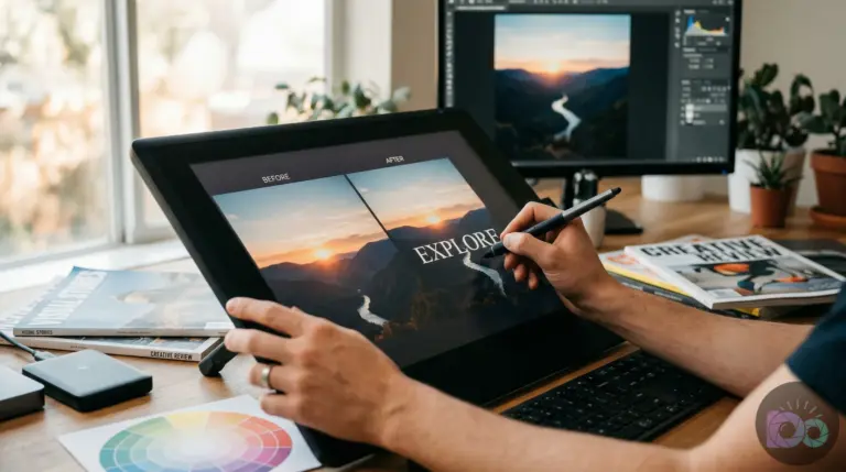
Use a quick visual QA step that matches how customers actually view the page. Check a product image at 100% zoom for halos around edges and color banding in gradients. Then open the page on a phone and look for mushy text in infographics, especially Instagram-style quote graphics. If you need a fast path for one-off compression, an online image compressor is handy, as long as you still resize before you compress.
If you want a deeper method focused on keeping visual quality while reducing file weight, read how to optimize images for web speed without quality loss and borrow the quality-check routine for the image types you publish most.
What image format should you use for the web (AVIF vs WebP vs JPEG vs PNG)?
The best image format depends on what the image contains and where it appears. Photos usually shrink best as AVIF or WebP, logos and icons often belong in SVG, and transparency-heavy graphics typically stay in PNG (or a modern alternative if your stack supports it). The goal is simple: pick the smallest file that keeps the details your audience notices.
For photos, prefer AVIF when your pipeline can serve it, with WebP as the common fallback, and JPEG as the safe baseline. For graphics with flat colors and sharp edges, WebP can work well; still, PNG often wins when you need reliable crisp transparency and your delivery setup can’t handle modern fallbacks cleanly. For UI screenshots with text, test carefully because aggressive compression blurs letterforms, and the “smaller file” becomes a frustrating asset.
Browser compatibility is the practical constraint. WebP support is strong across modern browsers, and you can validate coverage before committing to a WebP-first strategy using WebP browser support. AVIF coverage is also broad on modern browsers; even though that’s encouraging, a safer plan for mixed audiences is serving AVIF or WebP with a JPEG/PNG fallback, so nobody gets broken images.
Here’s a decision table you can apply to every page when you’re deciding how to optimize images for web and avoid format churn:
| Image type | Best default | Fallback | Rule of thumb |
|---|---|---|---|
| Product, lifestyle, portraits (photos) | AVIF or WebP | JPEG | Choose modern formats for byte savings; keep JPEG as the safety net. |
| Logos and icons | SVG | PNG | Use vector when possible; PNG only when SVG isn’t an option. |
| UI screenshots, charts with text | PNG or carefully tuned WebP | PNG | Protect legibility; don’t force aggressive photo compression. |
| Transparent overlays, cutouts | PNG or WebP (if your delivery supports it) | PNG | Transparency drives the choice; verify edges don’t halo. |
If you publish frequent social graphics, export choices can swing file size a lot. Canva exports can look clean but still be heavy if you keep “original size” and high-quality PNG for everything. The rule I use (por exemplo): photos rarely need PNG.
How do responsive images (srcset and sizes) reduce image bytes on mobile?
Responsive images reduce bytes by letting the browser download an image that matches the user’s screen size and pixel density instead of downloading a single oversized file for everyone. You provide multiple width variants and tell the browser how large the image will be in the layout. Then the browser picks the smallest acceptable resource for that device and viewport.
This is the difference between “I resized my images” and “mobile stopped downloading desktop files.” A single 1600-pixel hero might be fine on desktop, but a 360-pixel phone still downloads that 1600-pixel file unless you offer smaller variants. If you see “properly size images” in audits even after resizing, missing responsive hints is a common reason.
Use the standard approach described in MDN’s responsive images guide: provide a set of image candidates at different widths (for example, roughly 480, 768, 1024, and 1600 pixels) and declare a sizes rule that matches your layout. Avoid guessing. If your product cards are 50% width on desktop and close to full width on mobile, your sizes rule should reflect that pattern, not a single fixed number.
Mini case study (illustrative example): Imagine a mid-sized Shopify apparel store with a busy category page: lots of product tiles plus a wide banner at the top. PageSpeed Insights flags “Properly size images” and “Reduce unused bytes.” They regenerate thumbnails into a few smaller width variants, fix the sizes rule to match the real layout, and resize the banner to the actual max display width. The result is what you’d expect: mobile downloads much smaller files, and the template feels snappier because the browser stops pulling oversized assets it can’t display.
To validate that responsive images work, use Chrome DevTools Network: reload the page with cache disabled, filter by Img, and click the main hero or a product thumbnail. You should see the downloaded resource width align with the device viewport, not the biggest variant. If the browser still grabs the largest file, your sizes rule doesn’t match the layout, or your variants don’t include a small enough option.
What does PageSpeed Insights mean by “Improve image delivery” and “Optimize images”?
In PageSpeed Insights, “Improve image delivery” and “Optimize images” are umbrella messages that usually point to a small set of concrete problems: oversized dimensions, missing modern formats, weak compression, or missing responsive variants. The fix is not “do more optimization.” The fix is mapping the callout to the exact change you make to the asset or its delivery.
Use Chrome’s guidance on these opportunities as your baseline. The Lighthouse wording varies, but the actions stay consistent, and Chrome guidance: Improve image delivery mirrors what you’ll see in audits like “Serve images in next-gen formats,” “Efficiently encode images,” and “Properly size images.” Treat the audit list as your work order.
Here’s an “Image Fix Map” you can reuse across pages. It mirrors the audit names you’ll see in a PageSpeed Insights screenshot under Opportunities:
| PSI/Lighthouse callout | What it usually means | Exact action | How you verify |
|---|---|---|---|
| Properly size images | Image files larger than rendered size | Resize exports; add responsive variants and correct sizes rules | DevTools Network shows a smaller width file downloaded |
| Serve images in next-gen formats | JPEG/PNG used where AVIF/WebP would be smaller | Convert photos to AVIF/WebP with JPEG fallback | Response headers and file extension show a modern format served |
| Efficiently encode images | Compression quality too high or metadata heavy | Re-encode with a lower quality target; strip metadata if safe | File size drops while visual QA stays acceptable |
| Defer offscreen images | Below-the-fold images load too early | Enable lazy loading for non-critical images; exclude the LCP element | Waterfall shows below-the-fold images requested later |
One worked example shows how this translates into fewer bytes. Example (illustrative): imagine a homepage hero exported at a very large desktop resolution, then displayed much smaller on most screens. You resize the source to the real max display width, generate responsive variants down to small mobile widths, and convert to WebP (or AVIF) where it makes sense. The new desktop file drops substantially, and the phone-sized variant becomes a fraction of the original because the browser can finally request an image that fits the viewport.
Keep SEO and discoverability aligned with performance. Image delivery choices can affect indexing when URLs change or when you hide assets behind scripts. Follow Google Search Central: Image SEO best practices for crawlable image URLs, appropriate alt text, and stable page structure, so you don’t trade visibility for speed.
What is the fastest image optimization checklist you can apply to every page?
A fast image optimization checklist is a short sequence you can apply to any page template: identify the LCP image, fix pixel waste, enable responsive delivery, choose the right format, compress to a safe quality, then confirm the browser downloads the smaller file. It’s repeatable because every page has the same moving parts, even when the visuals change.
Run this checklist in order, and stop when the page’s biggest image requests are under control:
- Identify the LCP image and the top 3 largest image requests in DevTools Network.
- Resize each image to the real max rendered size on desktop; remove “just in case” oversized exports.
- Add responsive variants and correct layout sizing rules so mobile doesn’t download desktop bytes (this is where “responsive images srcset sizes” matters).
- Convert photos to a modern format with a fallback plan; keep PNG for transparency-only cases that need it.
- Compress to a quality target per image type; protect screenshots and text-heavy graphics.
- Lazy load below-the-fold images and keep the LCP image excluded from lazy loading.
- Re-run PageSpeed Insights and confirm the same audit names improved, not just the overall score.
For store owners, the biggest multiplier is consistency. If your CMS lets you upload any size, you’ll end up with a mix of lightweight images and multi-megabyte uploads on the same template. Set a simple internal rule like “product images export at 1600 pixels on the long edge, then generate smaller variants automatically,” and you’ll spend less time chasing individual outliers.
If you need a practical workflow for repeating checks across templates, you’ll get value from a repeatable audit loop for page speed, then apply only the image-specific steps from that loop to category pages, product pages, and blog posts.
How to troubleshoot common “optimized images” problems that still feel slow
If your images are “optimized” but the page still feels slow, the problem is usually delivery, not the file itself. You might have smaller files, yet the browser still downloads the wrong variant, loads too many images early, or waits on server latency. Fixing those issues can improve perceived speed more than squeezing another 20 KB out of a file.
Start with the symptoms you can see. If PageSpeed Insights keeps flagging “Properly size images,” open the rendered element in DevTools and compare its displayed size to the downloaded resource size. If the downloaded file is much larger, your responsive setup isn’t matching the layout. If “Defer offscreen images” persists, confirm that offscreen images don’t request during initial load; meanwhile, keep your LCP image exempt so you don’t delay the one visual that shapes the first impression.
Quality complaints usually trace back to applying one compression setting to everything. Photos tolerate more loss than logos, and text-in-image assets demand caution. If you export Instagram quote tiles from Canva or Photoshop, do a quick A/B check at the size people view them. If you see fringing around letters, back off compression or use a safer format for that asset. In practice, what works is keeping two presets: one for photos and one for text-heavy graphics.
If you want a simple execution option for one-off compression after you’ve resized, a free image compressor can help reduce bytes quickly. Just keep the workflow order intact: resize first, convert format when it fits, compress last, then verify the delivered asset in the browser.
Run PageSpeed Insights on a key template, copy the image-related opportunity names, and apply the Image Fix Map in order: resize to real display dimensions, add responsive variants with correct sizing rules, convert photos to a modern format with a fallback, and compress to a type-appropriate quality target. Then verify in DevTools Network that mobile downloads the smaller resource, not the desktop file.
If your next step is learn how to optimize photos for your website. choose the right format, resize, and compress images to boost page speed and improve your seo, How to Optimize Photos for Your Website: A Complete Guide is a dedicated option for that workflow.
FAQ
What’s the safest order for optimizing images on a website?
Resize to the real rendered dimensions first, then serve responsive variants for different screens, then choose the best format with fallbacks, and compress to a sensible quality target. Validate the downloaded file size in DevTools Network to confirm the browser is using the smaller resource.
How do I compress images on a website without making them blurry?
Use different compression targets by image type: photos can handle more compression than screenshots with text or logos. Check at 100% zoom for halos, banding, and soft text, then back off compression if those artifacts appear.
Do I need WebP if I already use JPEG?
WebP often reduces bytes for photos and many graphics, yet you still need a fallback plan for edge cases and older environments. Check compatibility using a browser-support source like Can I use before you switch defaults across your whole site.
Why does PageSpeed Insights still say “Properly size images” after I resized them?
The browser may still download an oversized variant because responsive variants or layout sizing rules don’t match the actual rendered size. Confirm the downloaded resource width in DevTools Network and adjust your responsive setup so mobile devices request smaller files.
Compress images without losing quality