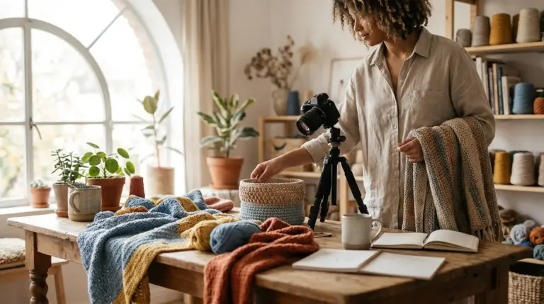
To create an aesthetic Instagram feed, focus on consistency. Use the same 1-2 filters or presets on all photos, make subtle adjustments to brightness and contrast, and always check your composition. These simple habits create a professional, cohesive look without requiring advanced editing skills or expensive software.
You take a great photo, edit it until it looks perfect, and post it to Instagram. The individual post gets likes, but when you look at your profile grid, something feels off. It’s a random collection of images, not a cohesive, professional-looking feed. This is a common frustration, but the solution doesn’t involve complex editing techniques. It’s about establishing a consistent visual language through simple, repeatable steps.
What Defines an ‘Aesthetic’ Instagram Feed?
An aesthetic Instagram feed is one where all the photos work together to create a unified mood, style, and color story. It’s not about each picture being perfect on its own; it’s about how they look as a collection. Think of it this way: your grid is like a magazine cover, and each post is a page inside. The cover needs to be compelling and consistent to make someone want to see more.
Consistency is the foundation of a strong visual brand on Instagram. When your followers see one of your posts in their timeline, they should instantly recognize it as yours, even before they see your username. This is achieved by repeatedly using the same visual elements. In practice, what I see most often is that users with the most appealing feeds are not necessarily the best photographers, but they are the most consistent editors. They establish a set of rules for their photos and stick to them. You can learn more about this process by exploring how to create an aesthetic Instagram theme from scratch.
How Can Filter and Presets Create Consistency?
Filters and presets are the fastest way to achieve a consistent look across all your photos. A preset is simply a pre-configured set of editing adjustments that you can apply to any photo with a single click. Instead of manually adjusting brightness, contrast, shadows, and colors every time, a preset does it for you, ensuring every image shares a similar base style.
Many beginners apply filters at full strength, which often makes photos look unnatural and overpowering. A better approach is to reduce the filter’s intensity. In most apps, including Instagram itself, you can tap the filter icon again to reveal a slider. Lowering the intensity to somewhere between 30% and 70% often produces a more subtle, professional result.
The key is to choose just one or two filters or presets that match the mood you want to convey and use them exclusively. Apps like VSCO and Adobe Lightroom Mobile are excellent for this, offering a wide range of presets you can customize and save. Sticking to a limited palette helps build that recognizable style that defines an aesthetic feed.

Why Does Composition Matter More Than Editing?
You cannot edit your way out of a bad photo. If an image is out of focus, poorly framed, or has a distracting background, no amount of filtering will fix its fundamental flaws. A strong composition is the skeleton of a good photo; editing just adds the finishing touches. Here are a few simple composition rules you can use with your smartphone camera:
- The Rule of Thirds: Turn on the grid overlay in your camera settings. Instead of placing your subject right in the center, position it along one of the lines or at a point where two lines intersect. This creates a more dynamic and visually interesting image.
- Keep Horizons Straight: A crooked horizon line is one of the quickest ways to make a photo look amateurish. Whether it’s the ocean, a field, or a tabletop, make sure it’s level. Nearly every editing app has a straightening tool to fix this in seconds.
- Use Natural Light: Artificial indoor lighting often casts a yellow, unflattering glow and creates harsh shadows. Whenever possible, shoot near a window or outdoors during the “golden hours”—the first hour after sunrise and the last hour before sunset—for soft, beautiful light that requires minimal editing.
What Are the Most Important Basic Adjustments?
Beyond filters, mastering a few basic adjustments gives you precise control over your image’s final look. You don’t need to use every tool available. Focusing on these four will solve most common photo issues. The goal is to make subtle enhancements, not dramatic changes.
Here are the core settings to learn:
- Exposure (or Brightness): This controls the overall lightness or darkness of the photo. Use it to fix a photo that is slightly too dark (underexposed) or too bright (overexposed).
- Contrast: This is the difference between the light and dark areas of your photo. Increasing contrast makes an image “pop” more, but pushing it too far can make it look harsh and lose detail in the shadows.
- Highlights and Shadows: These tools offer more targeted control than exposure. If the sky in your photo is too bright, lower the Highlights to bring back detail. If the subject is too dark, raise the Shadows to make it more visible without blowing out the rest of the image.
- Saturation: This controls the intensity of all the colors in your photo. Be very careful with this slider. A slight boost can make colors more vivid, but too much will make them look fake. Often, the ‘Vibrance’ tool is a better choice, as it intelligently boosts muted colors while leaving already-saturated colors alone.
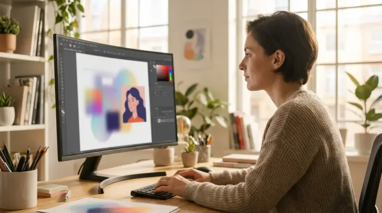
For a deeper dive into editing tools, you might find a guide on the best photo editing software for beginners helpful in choosing the right app for your needs.

How Should You Crop and Resize for Instagram?
Cropping is a powerful tool for improving composition after the fact. It allows you to remove distracting elements from the edges of your frame and bring the viewer’s focus directly to your subject. It can also help you conform to Instagram’s specific aspect ratios, which prevents the app from awkwardly cutting off parts of your image.
Instagram favors vertical photos. While you can post squares (1:1 ratio) or landscape images (1.91:1), vertical portraits (4:5 ratio) take up the most screen space, making them more impactful. To avoid quality loss from Instagram’s automatic compression, it’s best to crop and resize your image before uploading. The ideal width is 1080 pixels. For a 4:5 portrait, that means your dimensions should be 1080px by 1350px. You can easily set these dimensions with a free online image cropper to ensure your photos display perfectly every time.
A Practical Case Study: From Inconsistent to Cohesive
Consider a local baker who specializes in custom cakes and uses Instagram to attract clients. Her photos of the cakes were clear, but her feed was a chaotic mix of different lighting, backgrounds, and editing styles. Some photos were bright and airy, others were dark and moody. This inconsistency failed to build a recognizable brand, and her follower count had been stuck at around 800 for months.
She decided to implement a simple system. She chose a single Lightroom preset that gave her photos a warm, soft, and slightly desaturated look. She committed to shooting all her cakes in the same spot, next to a large window, to ensure consistent natural lighting. She also used a 4:5 portrait crop for every post to create a uniform grid layout.
The results were significant. Within three months, her Instagram feed looked professional, cohesive, and delicious. Her engagement rate increased by over 40% because the unified aesthetic was more appealing to her target audience. She organically gained 1,500 new, local followers who were genuinely interested in her products, leading to a direct increase in custom cake orders.
Creating an aesthetic Instagram feed is a game of consistency, not complexity. You don’t need to be an editing expert. Instead of trying to master every tool, pick one tip from this guide to implement now. For your next three posts, commit to using the same filter at 50% intensity. This small, manageable step is the best way to start building a grid that looks intentional and professional.
FAQ
Should I edit photos directly in the Instagram app?
While Instagram’s built-in tools are convenient for quick adjustments, using a separate app like VSCO or Lightroom Mobile offers more control. These apps allow you to save presets, ensuring every photo you edit has the same consistent look, which is key for an aesthetic feed.
How do I find my personal Instagram ‘aesthetic’?
Start by looking at accounts you admire. Identify common elements in their feeds, such as their color palette (e.g., warm tones, pastels, monochrome) or mood (e.g., bright and airy, dark and moody). Experiment with different filters and editing styles until you find one that reflects your personality or brand.
Can editing fix a blurry or out-of-focus photo?
Unfortunately, no. While sharpening tools can slightly improve a soft image, they cannot fix a photo that is genuinely out of focus or blurry due to camera shake. The best solution is always to ensure your photo is sharp when you capture it.
How many main colors should my Instagram feed have?
A good starting point for a cohesive theme is to focus on 2-3 dominant colors. This creates a visually pleasing and recognizable palette without being overly restrictive. You can use online color palette generators to find shades that complement each other well.