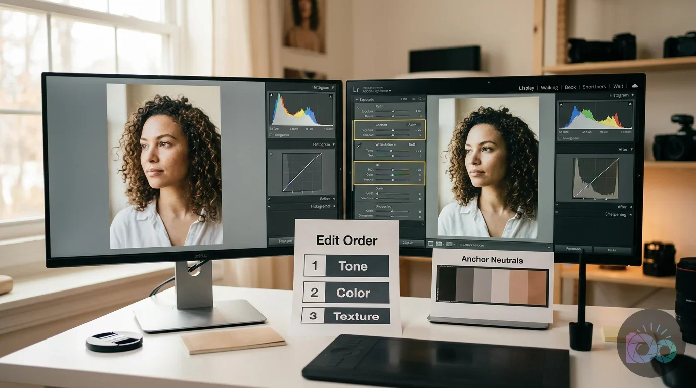
Consistent photos aren’t an accident. You achieve that signature look by pulling three specific levers: tone (exposure and contrast), color (white balance and HSL), and texture (grain and sharpening). If you keep your skin tones and neutrals steady, you can confirm the match with your histogram. This ensures every photo lands in the same tonal range, regardless of where it was shot.
You’ve likely seen the frustration of a disjointed gallery. Imagine you’ve captured a stunning morning shot in a sun-drenched kitchen, but the next photo is a moody evening portrait in a dim living room. Individually, the photos are great. Side by side on your website, they clash. One feels airy; the other looks heavy and yellow. This visual friction forces your audience to work harder to recognize your brand, which usually leads to lower engagement. Still, the problem isn’t your gear or the locations. The issue is the absence of a repeatable editing system. Without a fixed workflow, you’re starting from zero with every image, making it impossible to replicate a specific mood. The fix is to move toward a system-based approach using objective checks and a fixed order of operations.
How do I make my photos look consistent (even across different lighting)?
Consistency isn’t about every photo having the same light; it’s about every photo reacting to light in the same way. The foundation of a cohesive look starts with white balance, which sets the overall temperature and tint. If your indoor shots have a heavy orange cast while your outdoor shots are blue, filtering won’t help. Since you need a clean baseline, neutralize global color shifts first across your entire library.
Here’s a practical workflow for varied lighting. Imagine moving between a bright café and a dark studio. Your primary goal is to match the anchor colors. In lifestyle photography, those anchors are usually skin tones and white backgrounds. If the whites in your café photo look neutral, adjust the temperature in your studio photo until its whites land at the same point. Plus, this bridge lets the viewer’s eye move between images without a jarring shift. If you manage a large volume of images, using a consistent photo editing workflow matters more than the specific tool you choose.
- Analyze the light source: Identify whether the light is natural, artificial, or mixed.
- Match the neutrals: Use a gray card or a neutral white object in each scene to set a baseline.
- Normalize exposure: Keep midtones (skin or the main subject) at the same brightness level in every shot.
- Check the blacks: Decide whether shadows will be crushed (deep black) or lifted (faded gray) and apply that choice across the set.
Even though professional tools like Lightroom offer presets, a single click rarely works for every scenario. That’s why many creators move beyond basic apps like VSCO. While VSCO filters like A6 or M5 are helpful starting points, they don’t offer the granular control needed for complex lighting. A consistent photo aesthetic usually comes from manual adjustments in the HSL (Hue, Saturation, and Luminance) panel. By targeting the yellows and oranges created by artificial light, you can keep a clean look even in rooms with poor overhead bulbs.
What editing steps should I keep the same every time to build a recognizable aesthetic?
A recognizable style relies on a fixed order of operations. If you adjust color before correcting exposure, your colors can shift unpredictably as you brighten the image. This often creates a muddy look. Use a checklist that treats the edit like a sequence of layers, starting with core corrections and ending with your stylistic finish. Besides, a consistent sequence helps when you need to remove backgrounds from images because the baseline stays predictable.
- Base Corrections: Fix lens distortion, crop the image, and set your white balance.
- Global Exposure: Adjust exposure, highlights, and shadows to match your preferred brightness level.
- Tone Curve: Set contrast and define how your shadows behave (for example, a matte look).
- HSL Tuning: Make targeted adjustments to specific colors (greens, oranges, and yellows).
- Stylistic Finishes: Add grain, vignettes, or sharpening to finalize texture.
These repeated steps are the DNA of your style. If your look depends on muted greens, that HSL move needs to appear in every outdoor edit. Because repeatability is what turns random snapshots into a professional aesthetic, you must be disciplined. For product photography, you might use an online background remover to isolate the subject before applying the same sequence, ensuring product color stays true across different environments. Then again, don’t be afraid to tweak the intensity based on the specific photo’s needs.
How do I create a preset that matches my style without over-editing?
A Lightroom preset for consistent photos is useful, but it’s often misunderstood. Many beginners apply a preset and stop there, which creates a plastic, over-processed look. A preset works best as a partial solution: it handles your core color grading and curve choices, while you adjust exposure and temperature by hand for each image. Unless you set the base on every image first, the preset will never look natural across different shoots.
To create a balanced preset, start with a hero image—a photo that represents your ideal lighting and subject. Build your look with the HSL panel and the Tone Curve. When you save the preset, uncheck “Exposure” and “White Balance.” Lighting changes constantly, so baking those into a preset usually creates inconsistent results. Yet, keeping them unchecked forces you to pay attention to the unique light of every frame.
| Aesthetic Goal | Primary Adjustment | What to Avoid |
|---|---|---|
| Airy & Bright | Lift shadows, desaturate yellows | Blown highlights (losing detail in whites) |
| Moody & Earthy | Crush blacks, warm temperature | Muddy skin tones (too much orange) |
| Clean & Clinical | Neutralize WB, high contrast | Over-sharpening (digital noise) |
| Film-Inspired | Fade blacks, add grain | Extreme color shifts (unrealistic greens) |
| Warm & Cozy | Warm WB slightly, reduce blue saturation, soften contrast | Yellow skin and dirty whites |
| Cool & Crisp | Cool WB slightly, control aqua/blue saturation, keep whites neutral | Cyan shadows and lifeless skin tones |
When you use professional presets, notice how they handle skin tones. They often target the orange and red sliders to keep skin looking natural while the rest of the image takes on a controlled tint. If your photos feel off after applying a preset, the issue is often orange saturation. Adjusting those sliders can help rescue a cohesive Instagram aesthetic photos feed when subjects have different undertones or stand under different light sources. Also, remember that a preset is a starting line, not a finish line.
How do I check if a photo fits my aesthetic before I post it?
Relying only on your eyes can be deceptive, since screen brightness and eye fatigue affect how you see color. To maintain a professional workflow, use objective checks. The most reliable tool is the histogram. If your look is bright and airy, your histogram should usually lean to the right. While a new photo might look good on its own, if it’s heavily left-weighted, it will read as an outlier in your feed.
Another practical check is the grid test. Before publishing, place your new edit next to your last nine photos. On a phone, apps like Unfold can help you preview how images interact. Watch for “vibrant spots,” such as one photo with greens that are much brighter than the rest, because it breaks the rhythm of the gallery. If one image feels visually dense, use a tool to crop image files into a uniform aspect ratio to support a consistent photo aesthetic grid.
- Skin tone neutrality: Do the subjects look like they belong in the same space?
- Shadow density: Are the darkest areas consistent across the last five posts?
- Highlight retention: Is the white point landing at the same brightness level?
- Color dominance: Is there a rogue color that isn’t part of your palette?
If an image fails these checks, don’t force it. Sometimes a photo doesn’t fit the brand identity you’ve built. Leaving it out protects the cohesive Instagram aesthetic photos you’ve worked to maintain. If the photo is needed but looks soft, you can try to upscale image resolution or clean up noise before you re-balance color to match your set. Plus, check your edit on both a mobile screen and a desktop to ensure the colors hold up.
How do I make my Instagram photos look cohesive without making everything look identical?
It’s normal to worry that consistency will make your work boring. Still, there’s a real difference between a cohesive feed and a repetitive one. Cohesion comes from a shared palette; variety comes from composition and story. You can shoot a coffee cup and a mountain range and make them feel related if they share white balance and a similar grain structure. Because each has a different amount of white space, the grid gains movement.
Vary your scale. A cohesive Instagram aesthetic photos grid often alternates between three types of shots: wide (landscape), medium (portrait), and detail (close-up). As long as your HSL adjustments—especially greens and yellows—stay in the same range, the viewer will read the set as one story. Unless you change the subject matter frequently, the grid can start to feel stagnant, so mix up your angles.
Your aesthetic is the filter through which you see the world. The world changes; the filter stays consistent. If your images start to feel too similar, introduce a single accent color that shows up only every third photo. This adds variety without breaking your style. Before you upload, keep web performance in mind by using a free image compressor, which helps pages load quickly without sacrificing clarity. Even though high resolution is important, speed is often more vital for user experience.
Debugging Inconsistent Photos: Common Symptoms and Fixes
Even with a system, some photos won’t cooperate. This often comes from color contamination—light reflecting off nearby surfaces and tinting your subject. If you stand next to a green wall, for example, skin can pick up a green cast that a standard preset won’t correct. To maintain consistency, troubleshoot the problem with a single-variable change instead of stacking multiple fixes at once. Then again, sometimes the simplest fix is the most effective.
A frequent issue is dirty whites: white backgrounds that look yellow or blue compared to the rest of your feed. In the HSL panel, reduce Yellow saturation and raise Yellow luminance to remove the cast. If shadows feel heavy, check your Blacks slider and your tone curve. Lifting the bottom-left point slightly can bring air back into a dark photo so it fits a lighter gallery. Also, watch out for over-saturated blues in the sky which can distract from your subject.
- Symptom: Skin looks too orange. Fix: Decrease Orange saturation and increase Orange luminance.
- Symptom: Greens are distracting. Fix: Shift Green hue toward yellow and lower saturation.
- Symptom: Photo looks flat. Fix: Increase contrast or pull down the Darks slider slightly.
- Symptom: Artificial light looks sickly. Fix: Reduce Yellow and Aqua saturation with targeted HSL adjustments.
For more complex issues, use specialized tools. Lightroom excels at color, but a dedicated background remover can remove wires or people that break visual flow. Pair those surgical fixes with your consistent editing order so each image still matches your system. While it takes extra time, the result is a professional portfolio that builds trust with your audience instantly.
If you want a consistent aesthetic, treat every edit as a repeatable system. Correct exposure first, lock white balance, shape contrast with the tone curve, and tune your HSL. Use skin-tone neutrality and your histogram as pass/fail checks, then debug problems with one targeted slider change at a time. Still, the most important part is the discipline to follow the same order every single time. When you export, use the same settings and run an online image compressor so your cohesive gallery doesn’t slow down your site. Since consistency is a skill built through repetition, keep practicing until the workflow becomes second nature.
If your next step is a practical guide to creating an e-commerce photography style guide. learn to define visual standards for lighting and editing to build brand trust, 6 Steps to a Perfect E-commerce Photography Style Guide is a dedicated option for that workflow.
FAQ
Is it better to use VSCO or Lightroom for a consistent aesthetic?
VSCO works for quick mobile filters, but Lightroom is superior for long-term consistency. It offers granular HSL control and the ability to sync edits across diverse lighting conditions that one-click filters can’t handle.
Why do my photos look different even when I use the same preset?
Presets don’t account for original lighting or exposure. You must manually adjust the white balance and exposure for each shot first so the ‘base’ matches your reference before the preset’s colors can look right.
How do I fix skin tones that look too orange after editing?
Use the HSL panel to select Orange. Lower the saturation until skin looks natural, then increase luminance to brighten the skin without adding more orange tint.
How many colors should I have in my brand palette?
Stick to two or three dominant colors plus one or two neutral anchors like white or gray. A tight palette makes your color decisions repeatable and keeps your visual thread clear.
Should I add grain to all my photos?
Subtle grain can act as ‘texture glue’ between different cameras. If you use it, keep the amount, size, and roughness settings identical across the set to make it look intentional.
Remove image backgrounds with AI