Favicon From Image Guide 2026: Sizes, ICO, and PNG
Make a favicon from an image with the right source crop, ICO and PNG sizes, HTML links, and a 16 px sharpness check.

Contents
To make a favicon from an image, start with a simple square mark at 512 x 512 px or larger, crop away extra whitespace, then export a favicon.ico plus PNG sizes for browser tabs, search, Apple touch icons, and app manifests. Preview the icon at 16 x 16 before shipping it. That’s where weak marks fail.
The Smallest Useful Favicon Set
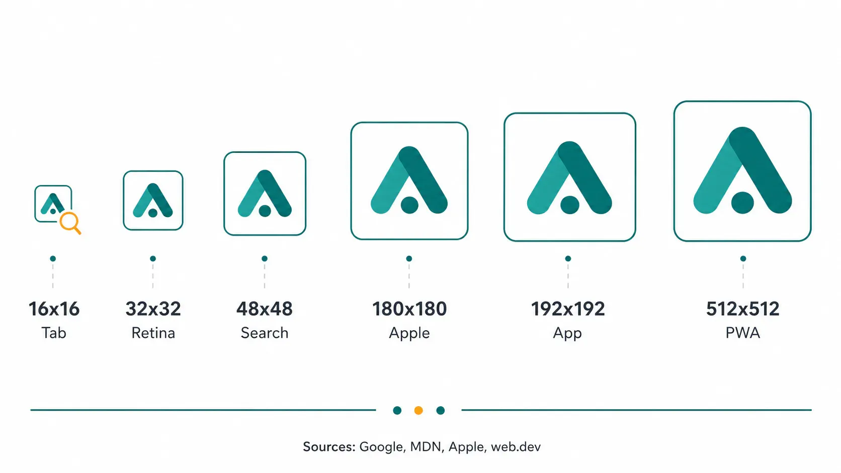
The practical favicon set is smaller than most generator ZIP files. For a normal website, I ship one ICO file, a 32 x 32 PNG, a 48 x 48 or larger search-safe PNG, a 180 x 180 Apple touch icon, and 192 x 192 plus 512 x 512 PNGs only when the site has a web app manifest.
That sounds fussy until you separate the jobs. A browser tab is tiny. A Google Search result icon is still small, but it has its own crawl and size expectations. A home-screen icon has more room and punishes corner detail less. Different surfaces, different mistakes.
| File | Use | Why it exists |
|---|---|---|
favicon.ico | Browser fallback | ICO can hold multiple sizes in one file |
favicon-32x32.png | Modern browser tab | Cleaner source for high-density screens |
favicon-48x48.png | Search result baseline | Google prefers favicons larger than 48 x 48 |
apple-touch-icon.png | iPhone and iPad home screen | 180 x 180 is the common retina iPhone target |
icon-192.png | Web app manifest | Android-style app icon slot |
icon-512.png | PWA install and maskable icon source | Large enough for generated variants |
The Google Search favicon guide is blunt about the search side: the favicon must be square, at least 8 x 8 px, preferably larger than 48 x 48 px, and crawled from a stable URL. The tab side is older and messier (which is why the ICO fallback refuses to die). MDN’s favicon glossary describes the common favicon as 16 x 16 and usually stored as GIF, PNG, or ICO, while the HTML link docs still show the rel="icon" path for regular sites.
Native Prep Before a Generator
Use your existing image editor first. If the source mark is a full logo lockup, a product photo, or a screenshot, the generator is already receiving the wrong object. Crop the symbol into a square, delete tiny taglines, increase clear space, and export a clean PNG before you make the favicon package.
On macOS, Preview is enough for this prep: open the PNG, crop a square around the mark, and export. On Windows, Photos or Paint can do the same square crop for one file. The native tools are boring, which is useful. The drawback is that they do not show you every downstream favicon size in one place, so you can accidentally approve a mark that looks good at 512 px and mushy in the tab.
If the source is a wide wordmark, use square crop first and keep the symbol or first letter inside the middle 70 to 80 percent of the canvas. The same safe-area thinking from this logo-safe-area guide applies here, just without the circular mask. Blank margin is not wasted space. It keeps the mark from touching the rounded corners on app surfaces.
Favicon From Image Workflow
Make the favicon from the image only after the source mark survives the small-size test. I use this order because it catches the real failure early: a detailed mark can technically export to every size and still read as a teal smudge in the browser tab.
- Crop the source image to a square.
- Remove tiny text, thin outlines, drop shadows, and hairline borders.
- Export a PNG at 512 x 512 px or larger.
- Downscale a copy to 16 x 16 and 32 x 32.
- Check the icon on a light background and a dark browser theme.
- Generate ICO, PNG, Apple touch icon, and manifest sizes.
- Upload the files at stable URLs and add the HTML links.
- Clear browser cache before judging the result.
For the local check in this run, I made a 512 x 512 block mark and exported 16, 32, 48, and 180 px versions. The 16 x 16 file was only 1,015 bytes, which is exactly the point: at that size, a clever interior shape becomes a few colored pixels. A plain silhouette wins.
When you want the whole favicon package without juggling exports by hand, use a favicon generator. A good one produces 16, 32, 180, 192, and 512 px assets plus an app manifest from one source image. The caveat is the same as every generator: it cannot redesign a busy logo for you. Feed it a clean mark.
Sizes That Actually Do Different Jobs
A favicon size table is only useful if it says what each size is for. The mistake I see in quick favicon jobs is treating 512x512 as the “best” favicon. It is the best source size for large app icons, but your browser tab still has to survive at 16 px.
Google Search wants a square favicon it can crawl, and its docs prefer a source larger than 48 x 48. Apple touch icons sit in a different lane; Apple’s Safari web content guide includes examples such as 152 x 152, 167 x 167, and 180 x 180, with the device choosing the most appropriate one. For installable web apps, web.dev’s manifest guide recommends a 512 x 512 icon if you choose only one size and notes that maskable icons need a centered safe zone.
Here’s my working split:
- 16 x 16: use this as the harsh tab preview, not as your source file.
- 32 x 32: include it for common browser favicon display.
- 48 x 48: cover the search-result threshold with room to spare.
- 180 x 180: include it for Apple touch icon behavior.
- 192 x 192: include it when you add a manifest.
- 512 x 512: use it for app installs and maskable icon generation.
That list is intentionally plain. If you are building a brochure site, you can stop after ICO, 32, 48, and 180. If you’re building an installable app, add 192 and 512, then test the maskable crop because operating systems may place the icon into circles, squircles, or rounded rectangles.
ICO, PNG, SVG, and Transparency
Use ICO as the fallback and PNG for the specific sizes you control. The MDN link element reference notes that the sizes attribute helps browsers choose an icon, and that ICO can store multiple icon sizes with broad browser support. Boring format. Useful result.
For explicit 32x32, 48x48, 180x180, 192x192, and 512x512 assets, PNG is the cleaner file. It keeps hard edges and transparency, which matters when your icon has a non-square silhouette. If the source file is bloated, compress after you generate the final sizes; do not crush the 512 px source before downscaling. For transparency-specific cleanup, the trade-offs in this guide are the same ones that matter here.
SVG favicons are fine for modern setups, but I don’t rely on SVG alone. Some favicon surfaces, crawlers, CMS themes, and older browser paths still behave better with PNG or ICO. If you start from a vector logo, export a simplified SVG for design use, then generate the raster favicon set from that simplified mark.
If the source image is WebP or AVIF and your editor won’t open it cleanly, convert it to PNG first. That is a better first step than screenshotting the logo, because a screenshot bakes in scaling artifacts before you start. Araluma PNG to WebP is useful later if you need a smaller web asset, but keep the favicon source as PNG while editing.
HTML Snippet and Cache Check
Put the favicon files in stable locations, then reference them from the document head. The names can vary, but the intent should stay obvious when someone opens the project six months later.
<link rel="icon" href="/favicon.ico" sizes="any"><link rel="icon" type="image/png" sizes="32x32" href="/favicon-32x32.png"><link rel="icon" type="image/png" sizes="48x48" href="/favicon-48x48.png"><link rel="apple-touch-icon" sizes="180x180" href="/apple-touch-icon.png"><link rel="manifest" href="/site.webmanifest">
If the old icon keeps showing, assume cache first. Favicons are sticky in browsers, CMS previews, search crawlers, Slack link previews, and app-launcher caches. Change the file contents, keep the URL stable for Google, then test in a fresh browser profile before you decide the HTML is wrong.
Two checks catch most bad uploads:
- Open
/favicon.icodirectly in the browser and confirm it loads. - Inspect the page source and confirm the favicon links point to real files.
- Run the page through a deployment preview, not only localhost.
- Check the tab at normal zoom and 125 percent zoom.
If the source icon came from a tiny logo export, use Araluma Resize only after you understand the limit. Upscaling a 64 px mark to 512 px gives the generator more pixels, but it doesn’t restore the missing curves. For a real rescue, use the vector file or rebuild the mark as a simple shape.
When the Icon Still Looks Blurry
Blurry favicons usually come from one of four problems: the source mark was too detailed, the clear space was too tight, the browser is still serving an old cached file, or the page is pointing at the wrong size. Fix them in that order (which saves a pointless export loop).
Start with the mark. Remove small counters, thin lines, gradients, and type. If the icon only makes sense because the brand name is readable, it is probably a logo, not a favicon. Use the symbol, monogram, or first letter instead. If the logo itself is low-resolution, the advice in the low-resolution logo guide applies before you generate anything.
Then check the canvas. A mark that fills the full square may look bold at 512 px, but at 16 px it turns into a clipped block. I usually leave a visible gutter around the symbol and let the browser tab shrink the whole thing. Smaller, cleaner, sharper.
Finally, avoid turning the favicon project into a file-count contest. More sizes won’t rescue a weak mark, and a 1024 px source won’t make a thin tagline readable in a tab. Make one square source that reads at 16 px, generate the small package, and ship that. The next improvement is design work, not another export.


