LinkedIn Banner Size Guide 2026: Resize Without Cropping
Use the right LinkedIn banner size, crop a 4:1 safe zone, and export a sharp JPG or PNG that survives profile upload cleanly.

Contents
- The Exact LinkedIn Banner Size
- Personal Banner vs Company Page Cover
- The 16:9 Crop Problem
- Native Resize Options First
- Araluma Workflow for a Clean 4:1 Banner
- Export Settings That Avoid Blur
- LinkedIn Banner Size FAQ
- What size should a LinkedIn banner be in 2026?
- Why does my LinkedIn banner get cropped?
- Is PNG or JPG better for a LinkedIn banner?
- Can I use the same banner for my profile and company Page?
The LinkedIn banner size for a personal profile is 1584 x 396 pixels. Export it as JPG or PNG under 8 MB, and treat it as a 4:1 crop, not a normal landscape photo. If you start with a 16:9 image, keep the face, logo, or headline centered because LinkedIn can trim the edges on different screens.
The Exact LinkedIn Banner Size
LinkedIn’s profile cover help lists the recommended personal cover image at 1584 x 396 pixels, with JPG or PNG as the file type and a file size below 8 MB. That sounds simple until you remember the ratio: 1584:396 reduces to 4:1, much wider than a camera photo, a YouTube thumbnail, or most website hero shots.
Check first.
If you already have a finished banner, upload it in LinkedIn and use the built-in cover editor to crop, reposition, rotate, and adjust it. For a one-off resize on a Mac, Preview can also enter exact width and height values, resize by percentage, and keep proportions locked. Apple documents that path in its Preview crop and resize guide.
The drawback is preview accuracy. LinkedIn says the cover image can appear differently based on browser window size and screen resolution, so a perfect desktop preview can still feel tight on another screen. Native tools are fine for one file. They don’t teach you where the crop will bite (which is the hidden job here).
When you need a clean export from a source photo, start by setting the canvas to 1584 x 396, then use Araluma Resize if the source is too large or too small. Use the crop tool when the real problem is framing, not pixel count.
Personal Banner vs Company Page Cover
The personal profile banner and a company Page cover are not interchangeable. LinkedIn’s Page image specifications list a Page cover at 4200 x 700 pixels, with Page images capped at 3 MB. That’s a 6:1 frame, wider and shallower than the personal profile’s 4:1 banner.
Use this split before you export:
| LinkedIn surface | Recommended size | Ratio | File notes |
|---|---|---|---|
| Personal profile cover | 1584 x 396 px | 4:1 | JPG or PNG, under 8 MB |
| Company Page cover | 4200 x 700 px | 6:1 | PNG or JPEG, max 3 MB |
| Life main image | 1128 x 376 px | 3:1 | Page/Career Page asset |
One profile mistake I still see: someone designs one banner, then reuses it everywhere because “LinkedIn header” sounds like one slot. It isn’t. If the asset has a wordmark, a face, or a product screenshot, the wrong ratio changes the visual hierarchy before anyone reads a word.
For adjacent platform work, keep this size reference open, but don’t let those square and vertical formats leak into this export. LinkedIn’s personal banner is its own long strip.
The 16:9 Crop Problem
A 16:9 photo is the wrong shape for a LinkedIn banner. To fill a 1584 x 396 frame from a 1600 x 900 source, the image scales to 1584 x 891 and then gets center-cropped down to 396 pixels tall. That keeps 44.4% of the scaled height and removes 55.6%.
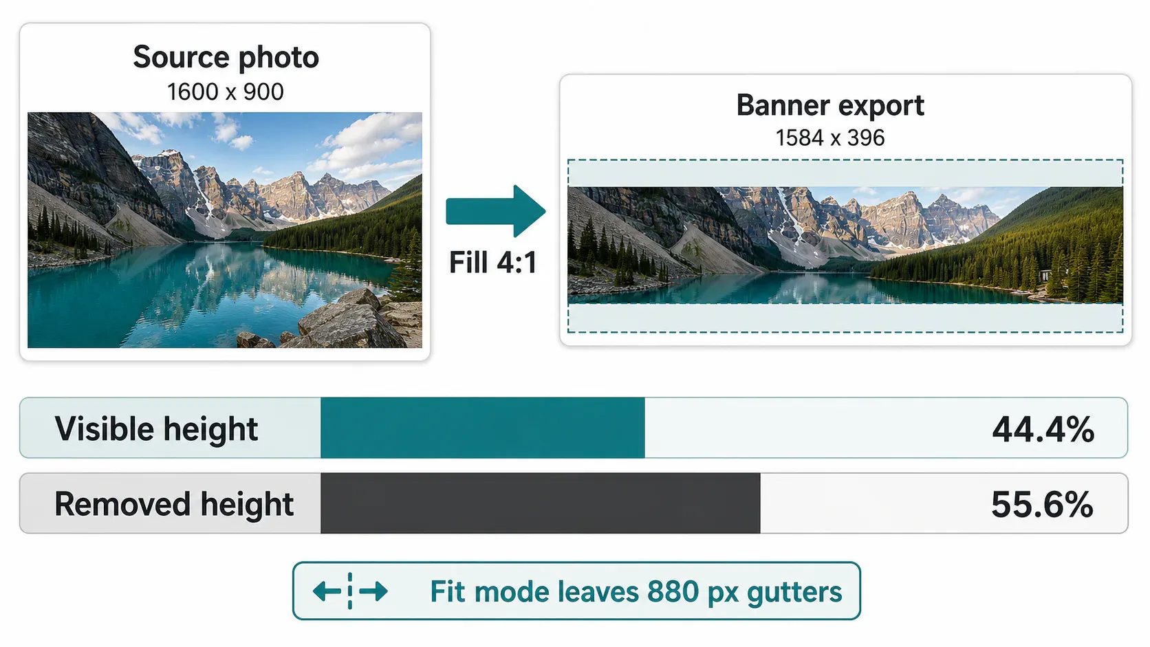
That is why a mountain photo, team portrait, or laptop-on-desk shot can look good in the editor and still lose the forehead, keyboard, or skyline after upload. The math is brutal because the banner is shallow. A 4:1 frame gives you a narrow horizontal slice, not a mini poster.
Fit mode has the opposite problem. If you fit the entire 1600 x 900 image inside a 1584 x 396 banner, the photo only uses 704 pixels of width and leaves 880 pixels of total side gutter. Fine for an intentional color-blocked layout (which can look sharp). Bad if you expected a full-bleed header.
My rule: use fill for abstract textures, landscapes, and blurred backgrounds. Use fit only when the whole object matters, like a full logo lockup or a product silhouette with edges you can’t crop. For people, build a separate banner crop instead of recycling the profile photo; the two jobs have different gutters.
If the source is sideways or rotated from phone metadata, rotate it first. Cropping a wrong-way banner wastes time because every safe-zone decision changes after the rotation.
Native Resize Options First
On macOS, open the image in Preview, choose Tools > Adjust Size, enter 1584 px width, and keep Scale proportionally on if you’re only resizing. If you need the exact 1584 x 396 frame, select the banner-shaped area first, crop it, then adjust the final size.
On Windows, Photos and Paint are the boring first stops for one file. Use the crop tool to get the strip, then resize to the final pixels. Paint is especially useful as a quick compatibility test because it exports ordinary JPG and PNG files. It is not where I’d build a polished brand header with safe-zone guides.
The native route is best when the banner is already designed and just needs the right dimensions. It gets weaker when you’re adapting a camera photo, a 16:9 slide, or a square product shot. At that point you’re making design decisions: which part survives, which edge can disappear, and whether the negative space feels intentional.
For the pixel math behind percentage changes, this guide is the slower, cleaner reference. Use it when a designer sends “make this 50% smaller” instead of a final pixel size.
Araluma Workflow for a Clean 4:1 Banner
Araluma works best here when you separate dimensions from composition. Resize first when the source is huge, crop second when the frame is wrong, then compress only if LinkedIn rejects the upload or the exported file is needlessly heavy.
- Open the source image and note its shape. A 16:9 image will need a hard top/bottom crop; a square logo will need side padding.
- Resize the image only if it’s extremely large or tiny. Keep aspect ratio locked so circles stay round and text doesn’t stretch.
- Crop to a 4:1 frame. Keep faces, logos, and headlines in the center band, not on the left or right edge.
- Export at 1584 x 396 px as JPG for photos or PNG for sharp flat graphics.
- Upload to LinkedIn and check the desktop preview at two browser widths before saving.
If the file fails, run it through Araluma Compress and try again. The trade-off is predictable: lighter files upload more easily, but over-compression can smear small type and fine hairlines. For a banner with text, I would rather crop cleaner and export once than crush a messy file three times.
For composition practice, the same “crop around the subject, not around the template” habit shows up in this 16:9 crop workflow. A YouTube thumbnail is taller than a LinkedIn banner, but the framing logic still helps: decide the focal point before you touch the resize fields.
Export Settings That Avoid Blur
Blur usually comes from starting too small, stretching the image, or exporting a thin strip with text that was never designed for a shallow header. The cleanest banner begins larger than 1584 x 396, gets cropped to 4:1, and then lands exactly on LinkedIn’s recommended pixels.
Use JPG for photographs, environmental textures, and soft gradients. Use PNG for logos, interface screenshots, flat color blocks, and type-heavy banners. LinkedIn accepts both for the profile cover, but the right choice depends on the content, not the platform.
Keep important text near the middle third of the banner. LinkedIn’s Page guidance says cover images may be adjusted to fit the screen and recommends placing important information in the center; that advice maps neatly to personal banners too. It also keeps the design from feeling left-heavy beside the profile photo on desktop.
One caveat: don’t pack a full résumé into the header. At 1584 x 396, the banner is wide but not tall. A name, a short positioning line, and one graphic element can read. Three logos, a slogan, a URL, and a QR code turn into gray noise.
LinkedIn Banner Size FAQ
What size should a LinkedIn banner be in 2026?
Use 1584 x 396 pixels for a personal LinkedIn profile banner. Export as JPG or PNG and keep the file below 8 MB. For a company Page cover, use 4200 x 700 pixels instead; that asset has a different ratio and a 3 MB cap.
Why does my LinkedIn banner get cropped?
Your banner gets cropped because LinkedIn’s personal header is a 4:1 frame. A 16:9 photo is much taller, so filling the frame removes the top and bottom. Center the important subject, or design a banner canvas at 1584 x 396 from the beginning.
Is PNG or JPG better for a LinkedIn banner?
Use JPG for real photos and PNG for logos, screenshots, type, and flat graphics. JPG usually gives smaller photo files. PNG keeps crisp edges better, but it can be heavier if the banner contains photographic texture.
Can I use the same banner for my profile and company Page?
I wouldn’t. A personal profile banner is 1584 x 396, while a company Page cover is 4200 x 700. They are different ratios, so one export will either crop badly or leave awkward padding on the other surface.
Build the personal banner as its own 4:1 asset. Keep the headline centered, export one JPG or PNG, and only make a separate Page cover if you actually need the company slot.


