Instagram Post Size Guide 2026: 1080x1350 or 3:4?
Choose 1080x1350 or a taller 3:4 Instagram post, keep the focal point safe, and export a clean crop without a surprise grid cut.

Contents
- The current upload range
- Why 1080x1350 is still the useful default
- Native crop controls first
- Pixel-exact exports for repeatable posts
- A simple crop sequence
- The crop check that catches weak posts
- File size after the crop
- Quick questions
- Is 1080x1350 still the best Instagram post size?
- Can I upload 1080x1440 to Instagram?
- Should I make every carousel slide 4:5?
Use 1080 x 1350 pixels (4:5) when your Instagram post needs a dependable feed-first frame. A taller 1080 x 1440 pixel file (3:4) also sits inside the platform’s current accepted upload range, but it gives you less room for a careless crop. Build around the subject, not the biggest available rectangle.
The current upload range
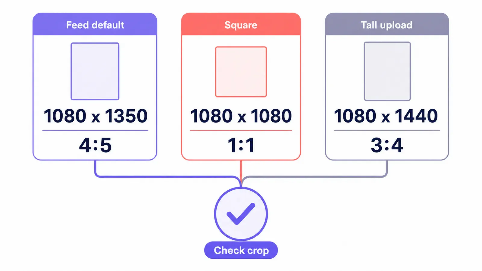
Instagram currently preserves an image between 320 and 1080 pixels wide when its ratio falls between 1.91:1 and 3:4. At 1080 pixels wide, that works out to a height from 566 to 1440 pixels. Files wider than 1080 pixels are sized down, while smaller ones can be enlarged. Those limits make 1080 x 1350 and 1080 x 1440 two legitimate choices, not competing folklore.
| Frame | Pixel size | Ratio | Use it when |
|---|---|---|---|
| Feed default | 1080 x 1350 | 4:5 | The feed image needs a predictable portrait crop |
| Square | 1080 x 1080 | 1:1 | The composition was designed as a square from the start |
| Tall upload | 1080 x 1440 | 3:4 | Extra vertical context matters and you will inspect the preview |
| Wide image | 1080 x 566 | 1.91:1 | A landscape scene needs its side-to-side read |
The ratio matters before the pixel count. A 4:5 frame gives a product, face, or headline enough vertical weight without turning every composition into a narrow poster. A 3:4 file can keep more of a tall object, but it also exposes more background and makes weak leading and empty gutters more obvious (especially when the background has no job to do). It’s a framing choice, not a bragging-rights number.
Why 1080x1350 is still the useful default
The 4:5 frame is the practical default because it asks the least from the crop. It is tall enough to give the subject some visual hierarchy, but short enough that a feed-first image does not depend on the edge behavior of a grid preview. If you post a product, a portrait, or a graphic with a single message, start there.
The math is plain. At 1080 pixels wide, 4:5 becomes 1080 x 1350. It sits comfortably inside the documented 1.91:1-to-3:4 window and leaves a 90-pixel difference from the 1440-pixel-tall ceiling. That is not a reason to throw away a strong 3:4 photograph. It is a reason not to stretch a 4:5 concept merely because a taller box exists.
I would choose 1080 x 1350 for a campaign set that needs to look calm as people scroll. For a fashion image, a full-length product shot, or architecture where the upper frame actually carries the point, test 1080 x 1440 as a separate export. The trade-off is simple: extra canvas is only useful when it contains useful picture.
There is another quiet advantage to the 4:5 default: it makes a mixed campaign easier to art-direct. A tabletop product shot, a close portrait, and a typography card can share the same vertical rhythm without inventing a new crop rule for each one. That consistency matters most when the posts sit next to each other. The grid is not a museum wall, but the eye still notices when one image has its subject pressed against the top edge and the next one floats in a wide field of empty sky.
Native crop controls first
For one image, use the editor already on the device before opening another tool. On iPhone, open the photo in Photos, tap Edit, choose Crop, unlock the aspect ratio when you need a custom frame, and drag the corners around the subject. Photos also offers preset ratios, which is quick for a square draft. Its catch is precision: a preset does not give you a pixel-exact 1080 x 1350 export. That’s fine for a one-off, but not for a campaign kit.
Windows Photos makes the same basic route available: open the picture, choose Edit image, then Crop. It can crop manually or use preset ratios. That is enough when you are moving one hero shot around a little. It is not the tool I would use for six slides that all need the same 4:5 crop line; one mismatched horizon is enough to make a carousel feel improvised.
Keep the original. Crop a copy. The native edit is the right first stop, but it is easy to lose the more forgiving master frame once you save over it.
Pixel-exact exports for repeatable posts
When the job calls for a repeatable 1080 x 1350 canvas, use Araluma Resize after deciding what stays in frame. Set the width to 1080 and the height to 1350. If the incoming image has another ratio, don’t force it to fit by stretching. Stretching makes people look subtly wrong and turns circular marks into eggs.
Instead, Araluma Crop first. Put the product, face, or main line of text near the center band, then export the exact dimensions. This is a better workflow than reducing a 4000-pixel phone photo until it happens to land near the target. The frame is the decision. Resizing merely makes the decision shippable.
If you are preparing several formats from one master, make a short export list before you click anything:
- Keep the original full-resolution file as the master.
- Make the 1080 x 1350 feed export first.
- Make a square derivative only if the composition still reads as a square.
- Make a 1080 x 1920 version for Stories only after moving the focal point; a Story is not a tall feed post.
- Name the files by ratio, not by mood:
product-4x5.jpgandproduct-9x16.jpgbeatfinal-final-2.jpg.
For the last step, the Story dimensions are worth treating as a different brief. A 9:16 crop needs more vertical planning than either 4:5 or 3:4.
A simple crop sequence
Start wide enough to keep the whole subject, then tighten deliberately. First place the crop around the subject’s visual center, not necessarily its geometric center. A bottle with a tall cap, for example, needs a little more air above it than a flat-lay object. Next, look at the outer 10 percent of the canvas. If that band contains a finger, a product edge, a word, or a bright distraction, correct it before resizing. Last, shrink the preview until the image is about the size of a phone feed card. If the point of the photo is not obvious there, it will not become clearer after upload.
This is where the browser tool earns its keep. Pixel dimensions make the crop repeatable across a batch, and a locked canvas keeps the series from drifting. But a fixed frame is also unforgiving (which is exactly why a master file matters). If one original is genuinely wide, choose the square or landscape treatment for that post rather than shaving useful context from every edge to satisfy a template. Consistency helps. Mechanical sameness doesn’t.
The crop check that catches weak posts
The useful test is not whether the export has the correct dimensions. It is whether the important element survives a tighter center crop. A logo at the top edge, a product handle near the side, and a face cropped at the chin can all pass an export dialog and still look careless in a smaller preview.
Before publishing, make a quick square crop from your chosen file. You are not necessarily going to post that square version. You are using it as a stress test. If the product loses its counter-form, the person loses an eye, or the headline becomes two awkward fragments, move the focal point inward on the master and crop again.
This is where a 3:4 upload can trip you up. The taller shape feels generous while you edit, then the grid asks a different question. Do not solve that by adding giant margins to every photo. A little whitespace can improve contrast; a padded image with no visual weight just looks like it missed the brief.
The same test helps outside Instagram. The Pin formats reward a different tall composition, while thumbnail framing shows why a wide frame needs its own focal-point check.
File size after the crop
Do the crop and resize before compression. Instagram may size down a file wider than 1080 pixels, but sending a giant original still makes you wait through an upload that will not preserve its extra pixels. Once the file is 1080 x 1350, examine fine lines, skin texture, and any small type at full size.
Then use Araluma Compress only if the exported file needs to shed weight. Compression is useful for a batch of photo-heavy posts. It is the wrong place to repair a bad crop or a soft source image. If tiny text already looks shaky before compression, simplify the comp or export the graphic differently.
Want to make a derivative without rebuilding the crop? The scale-a-copy method is handy for a controlled smaller version, but preserve the 1080-pixel-wide export for the actual post.
JPEG is usually the sensible export for a photograph. A flat graphic with fine type or hard-edged color blocks may need a closer look before you compress it, because those edges show artifacts first. You’re making a post, not a format demonstration. Choose the file that keeps the actual design intact at feed size, then stop adjusting it. If it’s already clean, don’t keep turning the slider.
Quick questions
Is 1080x1350 still the best Instagram post size?
For most feed posts, yes. It is a 4:5 portrait frame that stays inside the documented accepted range and gives a predictable composition. Use 1080 x 1440 only when the extra 3:4 height carries meaningful image information and you’ve checked how the focal point holds up in a tighter preview.
Can I upload 1080x1440 to Instagram?
Yes, 1080 x 1440 is a 3:4 image, the tall edge of the platform’s documented accepted range for a 1080-pixel-wide photo. It is not automatically a better post. The taller frame needs a deliberate crop check because the extra top and bottom can weaken the grid read.
Should I make every carousel slide 4:5?
Use one ratio across a carousel when the slides are meant to read as one sequence. A 4:5 set is the safest starting point for mixed product, portrait, and graphic slides. If one image needs a very different frame, it usually deserves its own post rather than a compromised slide.
Export 1080 x 1350 when the post needs a dependable feed frame. Keep a 3:4 master only when the added height earns its place in the composition.


