Google Business Profile Image Sizes 2026: Logo, Cover, Posts
Google documents four image rules for a Business Profile: JPG or PNG, 10 KB to 5 MB, 250 px minimum, 720 px recommended. Every other number is convention.

Contents
Google publishes exactly four image rules for a Business Profile. The file has to be JPG or PNG, weigh between 10 KB and 5 MB, measure at least 250 by 250 pixels, and ideally 720 by 720. That is the entire documented spec. The 1024 by 576 cover photo and the 1200 by 900 post image you keep reading about come from somewhere else.
The four rules Google publishes
The whole spec fits in a sidebar. Google’s photo requirements page names two accepted formats, one weight window, and a pair of resolutions, then hands the rest of the section to video (30 seconds and 75 MB are the caps there). Quality gets a single sentence: the photo “should be in focus and well lit, and have no significant alterations or excessive use of filters.” Nothing about aspect ratio. Nothing about a safe area.
If you already have the shot, the built-in path usually gets it in range. Windows Photos and macOS Preview both crop to a square and export a JPEG in under a minute, and Google Photos does the same job on a phone. What none of them tells you is the byte count of the file you just wrote, so a logo that lands under Google’s floor looks perfectly fine on your desktop and fails silently at upload.
That’s the gap a browser tool closes. Drop the file into an image resizer, type 720 into both fields, and you can see the output weight before it leaves your machine.
Where the 1024 by 576 came from
Not from Google. Semrush’s spec roundup gives a cover photo of 1024 by 576 at 16:9, a 480 by 270 minimum, and a 1200 by 900 post image at 4:3, and the article never states where those figures originate. The same set turns up verbatim on scheduler blogs like RecurPost and PostFast. One unattributed table, copied sideways for years.
Here’s the split, laid against the vendor page:
| Slot | Documented by Google | Repeated by the roundups |
|---|---|---|
| Logo | 720 × 720 recommended, 250 × 250 minimum | 720 × 720, 1:1 |
| Cover photo | no dimensions given | 1024 × 576, 16:9, minimum 480 × 270 |
| Business photos | 720 × 720 recommended, 250 × 250 minimum | 720 × 720 or 1200 × 900, minimum 400 × 300 |
| Post image | nothing on the posts help page | 1200 × 900, 4:3, minimum 400 × 300 |
| Any file | JPG or PNG, 10 KB to 5 MB | “under 5 MB” |
| Video | up to 30 s, up to 75 MB, 720p or higher | usually omitted |
I’m not calling the convention wrong. 16:9 is a sensible guess for a strip that renders wide in Maps, and 1200 by 900 is a reasonable post export. But a number with no source can’t be treated as a requirement, and building your whole export workflow on one is how people end up re-cutting a logo they never needed to touch.
The 10 KB floor, measured
The floor is the interesting half of that range, because it’s the one people trip over. A flat brand mark carries almost no data (which is exactly what makes it a good mark). Solid disc, two knockout bars, white field. I drew exactly that at 720 by 720 and ran the exports.
Optimised PNG: 3,724 bytes. Reduced to an 8-colour palette: 1,965 bytes. Both refused, because both sit under Google’s 10 KB minimum. Even at the documented 250 by 250 floor the PNG came out at 7,287 bytes, still short. Saved as JPEG at quality 85, the identical artwork weighed 20,585 bytes and cleared the bar with room to spare.
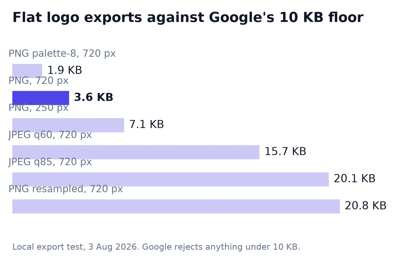
Then the part that surprised me. I drew the same mark at 2048 pixels and resampled it down to 720, which leaves soft anti-aliased edges instead of hard ones. Same artwork, same 720 by 720 output, 21,248 bytes. That is 5.7 times the hard-edged version at identical dimensions. Pixel count is not what decides whether a flat logo clears the floor. Edge detail is.
So the practical fix is a format change, not a resize. Run the mark through PNG to JPG at quality 85 and the file gets heavy enough to pass. The trade-off is measurable. On that same 720-pixel export, 8,474 pixels that were pure white in the PNG drift off white in the JPEG at quality 85, peaking 41 levels away along the edge of the mark. Drop to quality 60 and it becomes 12,085 pixels with a 97-level peak, which reads as a dirty halo. PNG is the correct format for a crisp mark and the wrong format for this particular upload, which is an annoying thing to have to say out loud.
If your only copy of the logo is a 200-pixel PNG scraped off an old site, resizing it up in the export dialog will not add detail. That is a separate job, and a logo upscale does it properly.
The cover photo you don’t fully control
Google is unusually blunt about this one. Setting a cover photo, per the same help page, “doesn’t guarantee the cover photo will show up as the first image for your business.” If Google decides your pick is low quality, or other signals suggest it is not the best representation, a customer’s photo can take the slot instead (which happens more often than owners expect).
Which reframes the work. You’re not designing a banner with a guaranteed position, you are supplying a candidate. That argues for a photograph that reads at thumbnail scale and survives being cropped by a layout you cannot see, rather than a composed graphic with a headline sitting near the edges. I keep the subject inside the middle 80% of the frame, which holds up in both the wide strip and the squarer thumbnail.
There’s a second reason to stop over-designing the strip. BrightLocal’s Local Consumer Review Survey 2026, fielded with 1,002 US adults and published in February, found that use of generative AI tools for local recommendations jumped from 6% to 45% in a year. Those systems read your categories and your review text. They don’t admire your composition.
If you want the wide version cut precisely rather than by eye, crop to exact pixel dimensions and export once.
The mechanics of a 16:9 cut are the same everywhere, and I have written up cropping to 16:9 cleanly for the thumbnail case.
The logo square, seen small
720 by 720 is the export. It is not the display size. In a knowledge panel the mark shows at a fraction of that, next to a business name set in a heavier weight than your wordmark probably is, and a logo that fills its canvas edge to edge reads as a smudge at that scale.
Give it margin. I scale a mark to roughly 70% of the square and centre it, which leaves enough whitespace that the counter-forms stay open when Google renders it small. A horizontal wordmark is the hard case, because the letters shrink twice: once by the aspect mismatch, once by the display size. The same trade-offs apply as fitting a wordmark inside a circle, and the answer is usually to ship the icon alone rather than the full lockup.
Post images and the 4:3 nobody promised
Google’s help page for updates and events describes what you can attach, and stops there. No dimensions, no ratio, no weight guidance for post images at all. The 1200 by 900 figure is convention wearing a vendor’s clothes.
For a post that mostly gets seen inside a card, a 4:3 crop at 1200 by 900 is a fine default, mostly because it matches what the roundups assume and nothing in the platform contradicts it.
Just don’t burn a headline into the bottom edge. Card layouts crop unpredictably, and the same discipline that keeps text legible on a Pinterest safe zone applies here.
What gets pulled after upload
Passing the file check isn’t the end of it. Uploads go through a policy review afterwards, and the operative criteria live in the Google Maps media guidelines, not on the Business Profile spec page. Four lines matter.
“The location should be the primary subject of the content.” A promotional graphic with a product cut out on a gradient isn’t a picture of your place.
“Avoid blurry or out-of-focus imagery.” This is the real argument for exporting above 720 pixels rather than at it, since an upscaled thumbnail on a retina display is exactly what blurry looks like.
“Avoid including distracting or inappropriate superimposed content.” Text overlays are the norm on Instagram and the exception here.
And the one worth reading twice: “Low quality media may be removed; quality removals can’t be appealed.” No form, no review queue, no second look.
One master file, three exports
Keep a single high-resolution master and cut everything from it (the master itself never gets uploaded). A 2048-pixel square for the mark, a wide original for the cover, and re-export whenever the convention shifts. Three presets cover the whole profile:
- Logo: 720 × 720, JPEG quality 85, mark at ~70% of the canvas
- Cover: 1024 × 576, JPEG quality 85, subject inside the middle 80%
- Photos and posts: 1200 × 900, JPEG quality 85, straight from the master
Weight is a non-issue for photographs, which is worth knowing before you spend an afternoon optimising. I took one 1600 by 1200 photo and cut it to each of those three sizes at quality 85. The square landed at 179,808 bytes, the cover at 226,622, the post at 379,712. Every one of them sits between Google’s floor and its ceiling, and the heaviest is still about 13 times under the 5 MB cap.
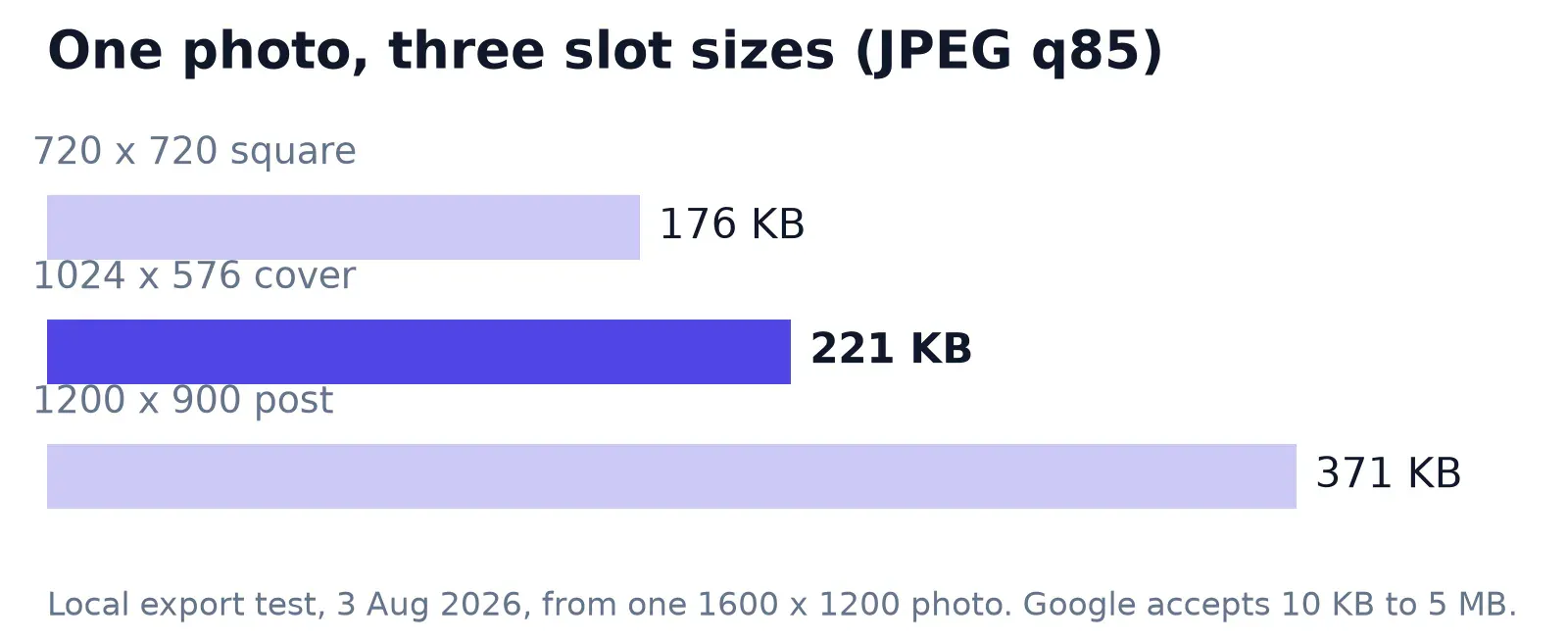
So compression here is about page-weight hygiene and your own upload speed, not about clearing a limit. If you’re batching a shoot before it goes anywhere near a profile, Araluma Compress will take a folder down without touching dimensions. Hitting a specific number is a different exercise, and I have covered target file size separately.
Questions people actually ask
What is the best image size for a Google Business Profile?
720 by 720 pixels, JPG or PNG, somewhere between 10 KB and 5 MB. That is Google’s own recommendation and it covers the logo, the profile photo and general business photos. The cover photo has no documented size; 1024 by 576 is the widely used convention.
Does Google Business Profile accept WebP or AVIF?
The help page lists JPG or PNG. Neither WebP nor AVIF is named, so convert before uploading rather than finding out at the form.
Why was my logo rejected when it looked fine?
Check the byte count first. A flat logo exported as an optimised PNG can land at 3 or 4 KB, which is under the 10 KB minimum. Re-exporting as JPEG at quality 85 typically pushes the same artwork past 20 KB.
Can I put text on a Business Profile photo?
You can, but Google’s media guidelines ask contributors to avoid distracting superimposed content, and low-quality media can be removed without appeal. Save the text treatment for platforms that reward it.
The honest ceiling on all of this: you control the file, not the slot. Google can still hand your cover position to a customer’s phone snapshot from last Tuesday, and no export setting changes that. Keep the master at 2048 pixels, re-cut when the layout moves, and spend the saved effort on the photos customers actually upload.


