Pinterest Pin Safe Zone Guide: Fit Text Without Truncation
Build a Pinterest Pin that keeps its headline, product, and logo visible by using the current safe zones, 2:3 canvas, and a smarter crop.

Contents
- The 2:3 canvas
- The asymmetric safe zone
- Crop choices before pixel changes
- Native routes for one-off files
- Browser workflow for repeatable exports
- Export and upload checks
- Quick layout answers
- Can a square image become a Pinterest Pin?
- Should the headline sit at the top?
- Is 9:16 better for a static Pin?
- Related framing decisions
Use a 1000 x 1500 pixel, 2:3 canvas for a standard Pinterest Pin, then keep the headline, logo, and focal product inside Pinterest’s published safe-area guides. The useful distinction is simple: resizing makes the file fit; cropping decides what survives. A tall layout can look great in your editor and still lose its most important edge in a feed preview.
The 2:3 canvas
Pinterest Business recommends a vertical 2:3 creative, or 1000 x 1500 pixels, for a standard image ad and says taller ratios may be truncated in people’s feeds. That makes 1000 x 1500 the practical starting canvas for a static Pin, whether you’re promoting a Shopify product, an Etsy listing, or a recipe post. Pinterest’s current creative guidance is more useful here than a pile of social-size charts because it names the ratio and the failure mode.
The number is not a magic crop. It is a proportion. A 2000 x 3000 export has the same 2:3 shape, so it can work if the original art is sharp and you need the extra pixels for another channel. What doesn’t work is forcing a square Instagram asset to fill this taller frame. You either crop the square, add deliberate breathing room, or make a new vertical comp.
Pinterest’s own organic-Pin documentation also accepts BMP, JPEG, PNG, TIFF, and WebP, with a 20 MB maximum on the web. Use JPEG for a photographic Pin and PNG when small type or flat color blocks need cleaner edges. Pinterest’s Pin spec is the source of truth for that upload check, not a template app’s export menu.
The asymmetric safe zone
Pinterest publishes an organic-Pin safe area of 270 px at the top, 65 px at the left, 195 px at the right, and 790 px at the bottom. Treat those as a visibility guardrail for text and other critical elements, not as four margins to fill. The right side and lower area are especially easy to underestimate when a design looks balanced on a large desktop canvas.
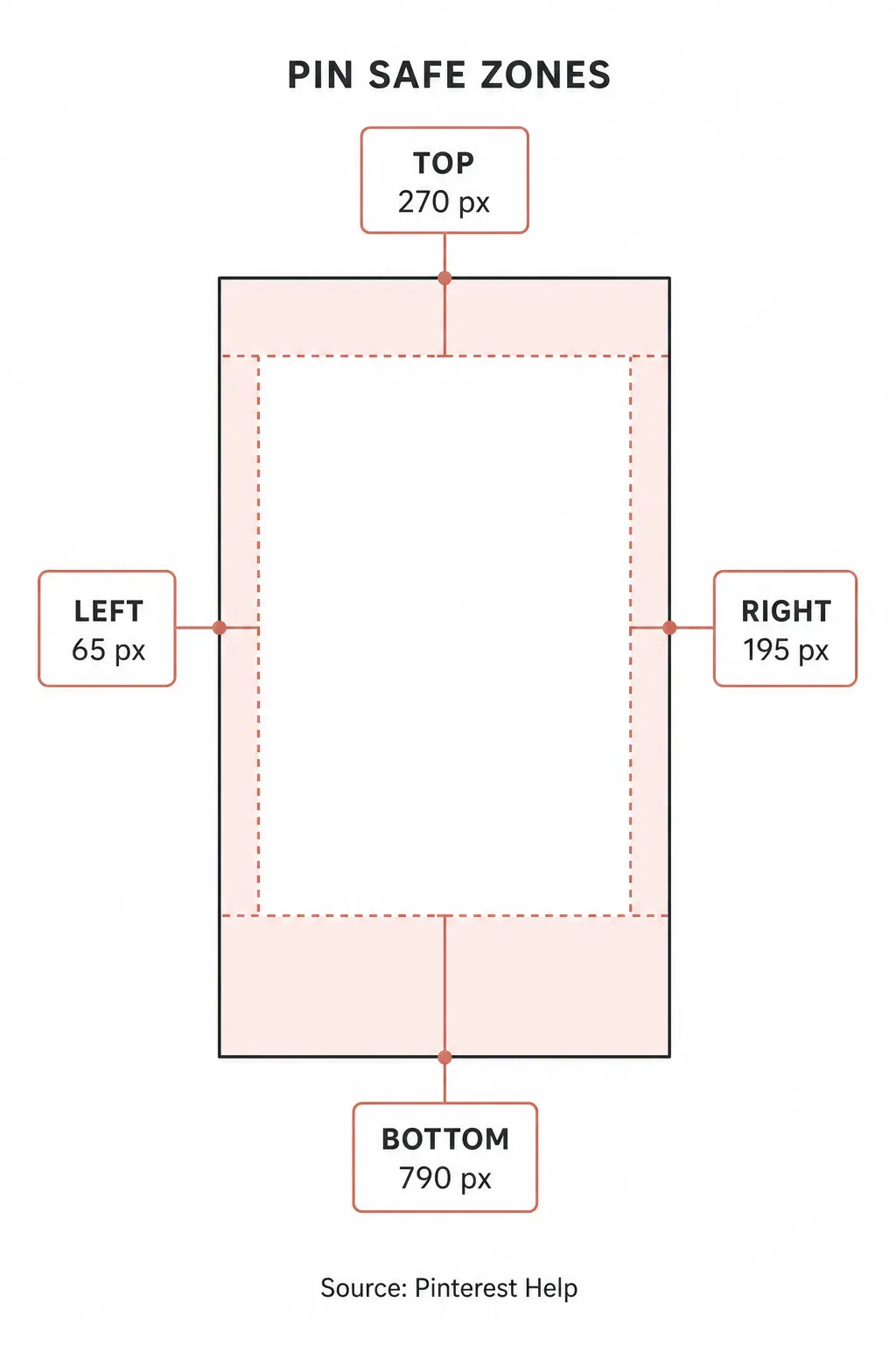
This is the useful part that generic size guides skip. The values are asymmetric, so centering a headline by eye can still leave it sitting too close to a published boundary. I’d keep the product’s most recognizable detail, the first line of the headline, and a small logo well inside the dashed area (a dull rule with expensive consequences). That gives the crop some slack when the feed, search, and close-up views treat the Pin differently.
The 790-pixel bottom figure also changes the design decision. Don’t treat the bottom third as headline real estate just because there’s empty canvas there. Put the primary message in the middle of the comp, then use the lower area for a background continuation, a secondary visual, or nothing at all. Whitespace is cheaper than rebuilding a Pin after the first preview looks chopped.
Crop choices before pixel changes
Crop first when the source photo has extra scenery. Resize first when its composition already works and you only need a smaller or larger export. That sounds obvious until you’re turning a landscape product shot into a vertical Pin, where the wrong order produces either a tiny product surrounded by dead space or a close crop that chops the handle, label, or texture a buyer needed to see.
For a wide product photo, I make the 2:3 frame first, place the object a little above the centerline, and check the safe-area overlay before I commit. The crop should protect the visual hierarchy: product first, short claim second, small brand mark last. If the image cannot do all three, use a color field or a second frame instead of shrinking everything until it reads like a postage stamp.
Araluma’s crop image tool is the quick browser route when you need to set that tall frame from a wider original. It won’t invent breathing room around a product, though. For an edge-to-edge hero shot, crop conservatively and let a neutral field carry the title rather than forcing text across a busy texture.
Native routes for one-off files
On a Mac, Preview is the first stop for a single finished comp. Open the copy, choose Tools > Adjust Size, enter the dimensions, and leave Scale proportionally selected. Apple also documents selecting multiple images in Preview’s sidebar before choosing Tools > Adjust Size, so it can handle a small set of already-composed variants. Apple’s Preview guide spells out both paths.
That native route is good at mechanical sizing. It does not give you a Pinterest-safe overlay, and it cannot decide which part of a landscape photo deserves to survive a vertical crop. Make the composition decision before you export. Otherwise, you’re only producing a precisely sized mistake.
Windows Photos is also fine for an emergency crop because it offers preset aspect ratios and a free rotation control. I’d use it to test a single source image, then save a copy and inspect the whole frame at phone size. It is easy to nudge a crop until the lamp, shoe, or label feels centered on a large screen, only to discover that the subject sits on the right-hand boundary when the Pin is viewed smaller.
Browser workflow for repeatable exports
For several Pins from the same campaign, start with a source comp that has a clear focal object and one short headline. Create the first 2:3 version, inspect it against the safe-zone values, then duplicate that layout for the other products. The repetition belongs in the grid and type treatment, not in blindly reusing the exact crop for every photo.
- Start with a 2:3 frame and place the focal object before adding type.
- Keep the first title line and the product’s identifying feature inside the published safe area.
- Export a copy at 1000 x 1500 pixels. If the source already has the right composition, use Araluma Resize instead of guessing with a percentage.
- Upload one test Pin and view it in the surfaces your audience actually uses.
- Save the source layout before making seasonal or product-specific copies.
That last step is boring, but it saves time. A product photo with a centered object can reuse the same grid; a photo with a handle, face, or package label near the edge cannot. Pinterest’s published safe zones are a reason to build a flexible template, not an excuse to turn every image into the same tall rectangle.
Export and upload checks
Before upload, check the ratio, critical content, file type, and file weight in that order. A file under the 20 MB web cap is not automatically a good Pin. A clean 1000 x 1500 JPEG with an unreadable claim is still a failed creative.
| Check | What to inspect | Decision |
|---|---|---|
| Canvas | 1000 x 1500 px | Use 2:3 for the standard static Pin |
| Focal subject | Product detail or face | Keep it inside the safe area |
| Title | First 40 characters | Put the useful words first |
| File | JPEG or PNG, under 20 MB on web | Export a new copy if needed |
Pinterest allows a Pin title of up to 100 characters, while Pinterest Business says the first 40 are the ones people are more likely to see. That is a writing constraint disguised as a spec: don’t bury the subject after a brand slogan. The Pin description can reach 800 characters, but Pinterest says descriptions do not show in the home or search feed, so the image and title need to do their own work.
If the export is over the web limit, use Araluma Compress after the crop and resize are locked. Compression is the last adjustment because it cannot rescue a weak frame. For a wider production system, see the companion for what to measure after the visual is safely on the platform.
Quick layout answers
Can a square image become a Pinterest Pin?
Yes, but a square image needs a deliberate vertical comp around it. Place the square photo inside a 2:3 canvas, then use a background color, a second detail crop, or quiet whitespace to make the extra height feel intentional. Do not scale the square up until it fills the canvas unless the subject has enough room to lose at the top and bottom.
For a product image, I prefer a color field over a blurred duplicate background. The blurred treatment often makes the Pin feel like a rushed Story asset. A solid field also gives the product a clean silhouette, lets the headline sit on a consistent contrast layer, and makes future color variants easier to build (the grid stays intact). If the source is too tight even for that approach, shoot or request a vertical image instead.
Should the headline sit at the top?
Usually, but not flush against the top edge. Pinterest’s published top guide is 270 px, so the headline needs enough air above it and enough distance from the product below it. Put the useful noun first, then the qualifier. “Ceramic lamp ideas” survives a fast glance better than a brand line followed by three vague adjectives.
The title field has its own limit. Pinterest allows up to 100 characters, but its Business guidance says viewers are more likely to see the first 40. That makes the on-image headline and the Pin title a paired decision: one should establish the visual promise, and the other should clarify the exact search intent without repeating the same five words.
Is 9:16 better for a static Pin?
No, not as the default static-image starting point. Pinterest recommends 2:3 or 1000 x 1500 for standard image creative and warns that taller ratios may be cut in feeds. A 9:16 composition can still be useful as a source for video or another vertical channel, but it asks a static Pin to live closer to the truncation edge.
Keep a 9:16 master only when the campaign genuinely needs a video-first asset. Otherwise, build the static Pin at 2:3 from the start. The smaller canvas forces a useful edit: less decorative copy, a stronger focal point, and enough gutter around the elements that matter.
Related framing decisions
Pinterest’s 2:3 frame is a different job from an Instagram portrait or a YouTube thumbnail. The Instagram post dimensions guide helps when the same campaign also needs a 4:5 feed asset, while that walkthrough is the right companion for a horizontal video cover. Don’t stretch one master asset across all three; build a source image with enough room to make intentional crops (especially when a product sits near an edge).
Once the frame is right, the image-weight workflow explains why the web version may need a separate export. If you only need a proportionally smaller source before any platform crop, use the percentage resize guide first.
Use 1000 x 1500 as the canvas, but judge the Pin by the middle of the frame. A headline that begins with the useful words and a product that keeps its defining detail will survive more surfaces than a perfectly measured layout that puts both at the edges.


